

THE STORY BEHIND MY BUSINESS CARDS AND LOGO
A simple symbol can hold profound meaning. This is the story behind my business cards and logo, and why the ensō circle became the perfect expression of the way I share numerology, timing, and purpose.
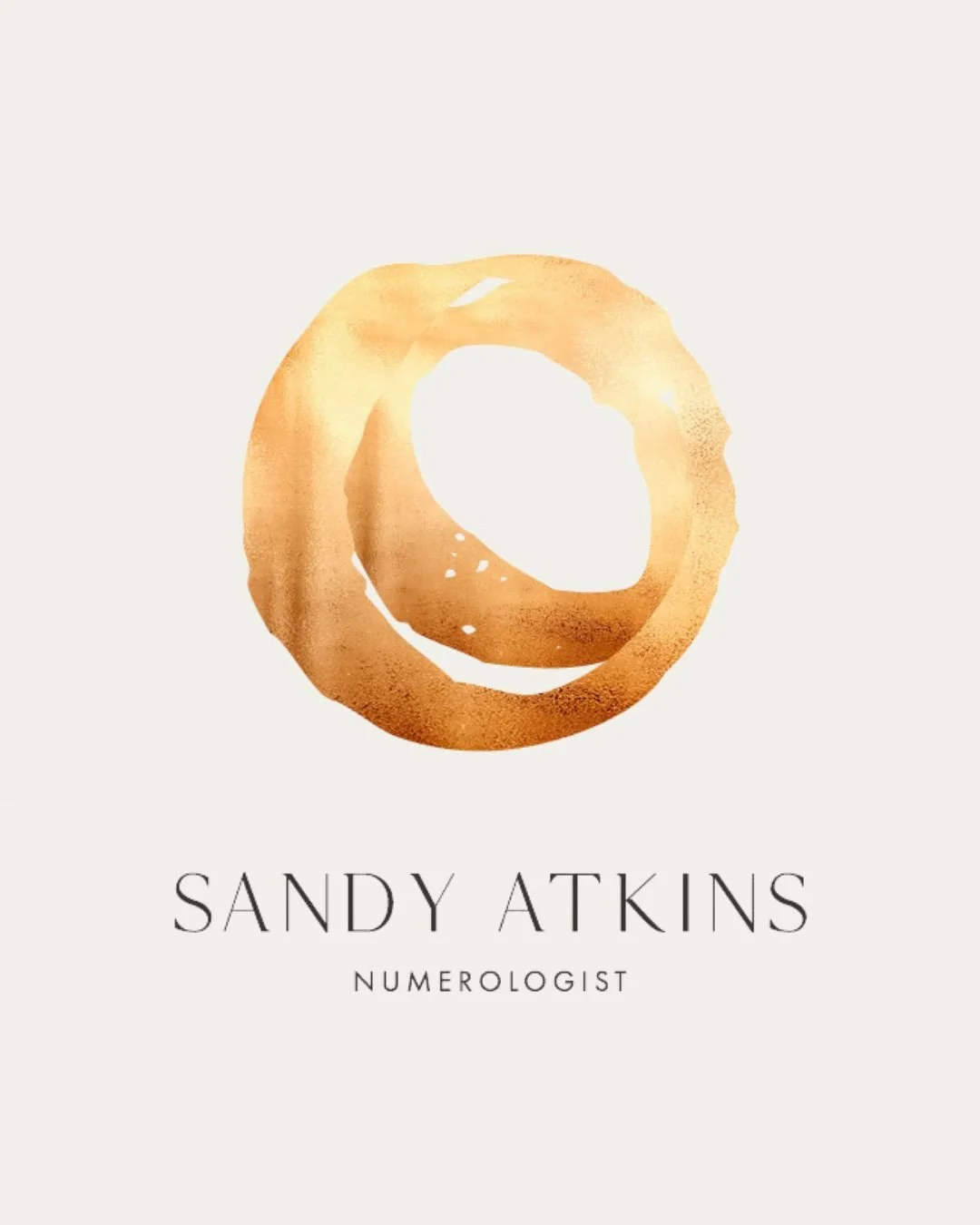
The meaning behind my circle logo, gold leaf design, and the spiritual simplicity I wanted my numerology work to carry.
When I created my business cards and logo, I wanted them to feel true to me and to the work I do.
I have always been drawn to circles. There is something deeply calming and complete about them. They carry a quiet power. They do not need to demand attention, yet they speak clearly. To me, the circle has always represented wholeness, flow, continuity, and spirit.
I was also deeply drawn to the work of Max Gimblett and the bold circular brushwork influenced by Japanese ink practice. In particular, I loved the ensō circle, a form created in one expressive movement. It felt alive, honest, and present.
The beauty of the ensō is its simplicity. It is minimal, yet full of meaning. It speaks of unity, flow, and the continual movement of life. It reminds me that we are always in cycles, always learning, always being led back to ourselves.
This is very close to how I experience Numerology.
For me, Numerology is not about making life more complicated. It is about returning things to their essence. It offers a simple way of understanding cycles, timing, patterns, and purpose. It helps us recognise where we are, what is moving, and how to work with life more consciously.
That simplicity matters to me.
I wanted my branding to reflect the way I work. Clear. Grounded. Spiritual, but not overstated. Meaningful, but not crowded. The circle became the natural symbol because it mirrors the way I see life itself. We move through seasons of growth, challenge, completion, and renewal. There is rhythm in that. There is continuity. There is a deeper intelligence moving through it all.
The ensō circle felt like the perfect visual language for my work.
It reflects the wholeness I believe people are seeking. It reflects the flow of spirit. It reflects continuity on the path to purpose. And it reflects my desire to share Numerology in a way that feels simple, accessible, and true.
I also chose to have the circle printed in gold leaf.
Gold has always felt sacred to me. I see it as God's light, the higher light that leads us. It carries the feeling of illumination, guidance, and something eternal moving through us. To place the circle in gold brought together the symbolism of wholeness and flow with the presence of higher wisdom and spiritual direction.
I did not want a logo that felt hard, sharp, or overly constructed. I wanted something that felt alive. Something that held both softness and strength. Something that suggested grace, movement, and meaning.
To me, it says that life is always moving, always teaching, always returning us to ourselves.
And that is what I hope my work offers.